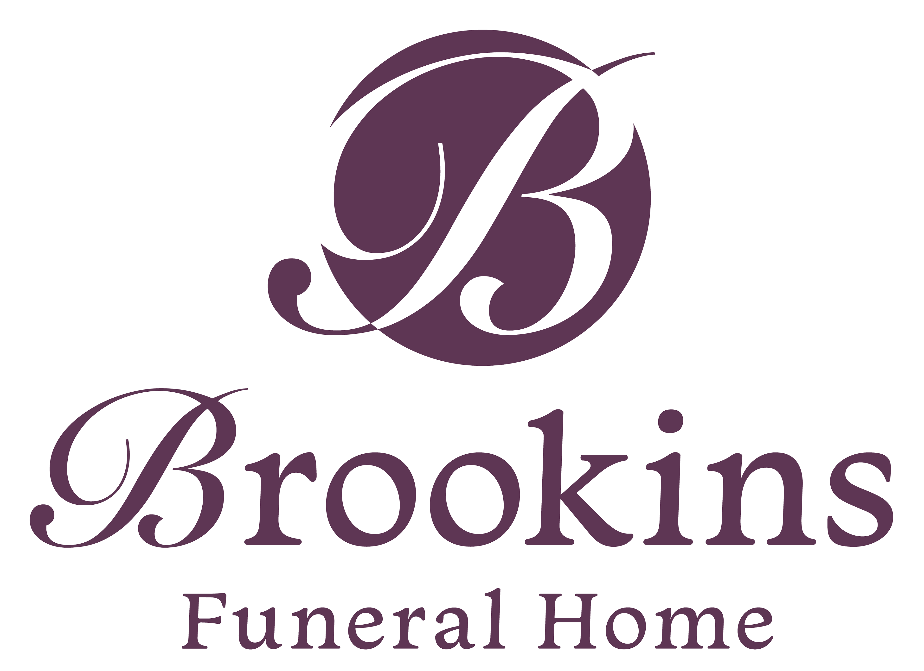
This simple and clean typography for the Brookins rebranding initiative reflects their highly respected and trusted role in their community for the past 50 years. The new logo design had to be adaptable to multiple variations for different use cases, as their family is involved in many local organizations outside of their funeral home business.
LOGO VARIATIONS

LOGO SYMBOLS


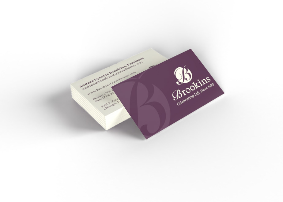
BUSINESS CARDS
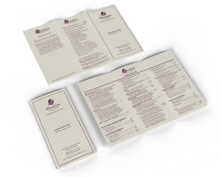
General Price List Trifold Brochure